The Story of Holy Ground’s Beautiful Functional Design

As today is the day we are launching Holy Ground, it is an opportunity talk about our overall logo, brand, and design. Sadly, discussion around things like branding sounds like marketing gobbledy gook, and for good reason. Most people who are exploring things like logo color and shape, typefaces, etc. are marketers trying to first and foremost make money. Thus it is natural that this topic is a bit polluted with an ethos of manipulation. That said, there are few other ways to talk about what gives a website its particular purpose and feel, crucial parts of how a website is communicating to others that it cares about them. In this way, Holy Ground is launching with a beautiful functional design because it cares about the people it is trying to help.
The purpose in sharing the entire design process here is to inspire others to do a similarly patient and rewarding approach themselves. Steps 1-3 below can serve as an outline. But first, some thoughts about design itself.
Good design cares about people
A website is beautiful and functional because it loves its readers, because it believes its visitors are important. Full stop. In contrast, let’s say a website launches around something scammy, like an online casino. The chance that this online casino will inspire people and function well is low. Likely its website will be clunky and boring. Why is this? It’s because most internet casinos are not really trying to be helpful to people. They are mostly looking to make quick easy cash.

The About page of a major online casino, and its almost unreadable body font. This website does not care about its visitors.
Websites with a goal of short-term profit usually have bad design because bad design is easy and common. Bad design can be done in a day, is thoughtless and is usually ugly. Good design is difficult and rare. Good design means taking the time and energy to patiently flesh out what a site is trying to communicate to people.
What good design says without speaking:
Good design communicates three important things:
Good design helps people understand what a site actually does. When somebody visits the homepage of Google, all they are greeted with is a logo and a single search box. What is the site trying to do? Search. “Go ahead,” Google is saying with their design. “Type anything in the box and click Search.” Similarly, our hope with Holy Ground is that people come to the site and quickly see that it as a place to learn life-giving theology. If Holy Ground has good design, visitors should quickly “get” what the site is trying to do.
Good design helps people understand a website’s soul. Some typefaces are more casual and emotional, while others are more formal and strict. Colors like blue are calming while colors like red are intense. Every design element communicates not just a function but also a feel. In this way, visitors to Holy Ground should get a feel for the site’s soul, for its way of being. We are not just trying to communicate some dry theological facts here. We are also trying to make learning theology deep and meaningful, because we believe faith in God is the most deep and meaningful thing in the world.
Good design helps people see into the heart of a site’s creators. Every website is created by flesh-and-blood people who have made careful (or clumsy) decisions to make the site look and work a certain way. If Holy Ground was like a casino website, trying to extract money from its visitors as quickly as possible, you might see 50 different advertisements covering every inch of the page. In contrast, we hope that visitors see that the site is beautiful and functional as a demonstration of our own hearts and intentions. Because all of us behind Holy Ground are hoping that visitors partner with us for decades, and the best way to make that happen is to put our very selves on display.
Good design is both functional and beautiful
This site had a goal from the beginning to be both functional and beautiful. Beauty on its own has neither purpose nor stability. Function on its own is tiring and uninspiring. Both are important. Both need to be there.
Function
If people come to Holy Ground and see beautiful paintings from the Renaissance flowing from every corner, if they see gorgeous typefaces and generous whitespace, it may make them feel a bit happy. But feeling happy is not why people first come here. The main reason why people will visit Holy Ground is because the site is useful. The information on the site needs to address some pain point in their lives. Most people will come to learn something specific.
Beauty
On the other hand, our goal with this site is not simply to provide dry answers to people who Got questions. Our goal is to make theology and God a life-giving experience. And this means that the feel of our theology needs to be inspiring, beautiful, and provocative. People need to come to Holy Ground for some specific purpose, but they need to leave with a general feeling of wonder and possibility. Yet wonder and possibility are not easily communicated in written text. Wonder and possibility are more easily communicated existentially: in shapes and images.
Both the function and the beauty of Holy Ground are very important. Function is always specific. Beauty is general. Function is why people will come to Holy Ground: to answer a specific question or address a particular pain point in their lives. But beauty is why people will stay. Beauty is how we consider remaining together. Thus Holy Ground’s design, from its very first day, is first meant to be helpful by getting people the specific information they want. But Holy Ground also hopes to make the experience a beautiful one so that people might be inspired to stay with us into the future (for example, by joining our mailing list).
Step 1: Identifying the site’s soul
Function and beauty are easy to talk about, but harder to actually create. These general airy terms need to be concretized in specificity. So how did we get to the web site that you see before you today? How did move from wispy concepts like "beauty" to an actual name, logo, and design?
The basis of every "hard" and objective design decision is rooted in something “soft” and ideal, like a website’s soul.
For example, consider that children are born with particular personalities. Some children are more wild; some are more tender. Every tangible thing that flows out of each child will emerge from their soulful nature: the sort of clothes they choose to wear, the toys they play with, and the sort of pictures they draw. Strong and wild children draw pictures of warriors fighting monsters; tender and soft children do not. Thus is revealed a particular truth about reality: all tangible objective decisions, if they are authentic, flow from a more primordial invisible affective nature and soul. In short, what we first needed to do was hammer out the site’s soul.
We began with the 12 archetypes of Carl Jung, and isolated two archetypes that represent the site:
Archetype #1: Explorer and adventurer
We realized that this site would, first and foremost, strive to make theology an adventure. Theology is a great adventure because it is ultimately about living in life-giving unity with the wild God who made the wild universe. Theology is about embracing His heart and risk, watching life unfold in its complete and majestic condition. Concepts we found around exploration and adventure were:
You only get one life
Wide-eyed wonder at existence
Life as a fantastic voyage
Vision moving from black and white to color
The different images of this theme were sweeping vistas of National Parks, foreign exotic cities, and alien worlds:

Adventurer explorer archetype mood board
A quote that summarized this theme was from Socrates: “Wonder is the beginning of wisdom.”
Archetype #2: Philosopher and sage
Yet we saw that adventure and exploration on its own is naïve, like a hippy who gets killed hitchhiking through warzones. We wanted balance, our adventure to be anchored, and that anchor turned out to be philosophy. Philosophy literally translates to "the love (philo) of wisdom (sophia)". Every day people go on the internet and see some site or video encouraging them to “Click here!”, to make rash decisions to buy things, or to support high-emotion political causes. In contrast, we believe the Way of God is often wise and patient, and thus grounded – grounded in the Holy Spirit, in ourselves, and in God’s creation. Concepts we found around the philosopher and sage were:
Christian existentialism
Intelligence that leads to wisdom
Monasticism
Dusty books and forgotten histories
The different images we kept finding around this theme were of orthodox iconography, small country churches, bottles of scotch, and people on long train rides:
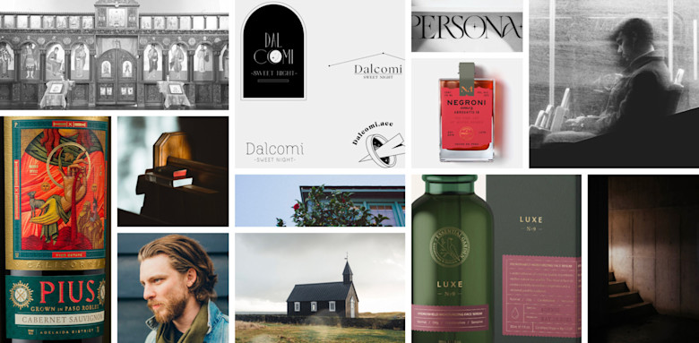
Sage Philosopher archetype mood board
A quote we identified with this theme is by J. J. van der Leeuw: “The mystery of life is not a problem to be solved; it is a reality to be experienced.”
Step 2: Establishing our name, logo, colors, and typeface
Once we realized that the site’s soul was one of grounded-adventure and philosophical-explorers, the next task was to establish our specific name, logo, color scheme, and typeface. Again, witness the tangible flowing out of the intangible.
Choosing the name Holy Ground
We realized our name should be both unique and simple. This is often a real challenge. For example, it’s easy to create a name that is unique. Here, let’s mash the keyboard: ewrgfauhaegru. Behold! The name Ewrgfauhaegru is immediately special, unlike any on earth! And yet, nobody is going to remember this name because it is hard to read and impossible to remember.
This is seen in many modern startups that use odd spellings. For example: take Lyft, a popular ride-sharing app. The name "Lyft" is certainly unique, but its Y makes the name tricky to read and remember.
Take the following conversation:
Guy: “What’s the ride app we're using?”
Girl: “Oh, it’s Lyft."
Guy: “Cool. Got it. Lift.”
Girl: “Yeah, but lift with a y. Lyft.”
Guy: “Huh?”
Girl: “Um. So you switch the i in lift with a y. So it sounds the same but looks different.”
Guy: “Oh. So y like in cry?”
Girl: “No. A y that sounds like an i, like you need a lift to the mall. Lyft.”
Guy: “Huh.”
In contrast, Lyft’s main competitor is a ride-sharing app named Uber. This is a fantastic name (though perhaps a less than fantastic company). The word Uber is incredibly easy to read and remember, yet still quite unique and has connotations of speed which is key for needing a ride.
Likewise, we wanted a name that was unique, that communicated our archetypes of adventure and philosophy, yet was easy to read and remember. Also, the name had to have its .com domain available to purchase. After months of looking at hundreds of various explorer/sage theology names, one stood head and shoulders above the rest: Holy Ground. Simple to read and remember and yet unique in its imagery of thoughtful exploration. Thus our name.
Our blackletter logo and lithographic color scheme
With Holy Ground name finalized, we could begin work on what sort of logo and colors might represent it. We realized that a logo that used a blackletter type would exude an ethos of grounded adventure. Blacklettering was used in beautiful ancient manuscripts during the late Middle Ages, an era of history that, despite pervasive brutality and disease, also contains inspiring images of brave knights and precious hand-penned manuscripts. Thus Holy Ground’s blackletter logo was born.
Holy Ground's blackletter logo
Next we needed to land on a color schema that echoed a similar quality as the blackletter logo. Coloration that we kept coming back to was seen in antique lithographic postcards. Lithography is an older style of printing that has great legacy. It created color images through overlaying primary colors on top of each other, resulting in a distinctive washed-out coloration. Lithography was used in some of the oldest color texts in history, like some of the earliest colored books on flora and fauna. We thought it a perfect fit for Holy Ground’s ethos of grounded wonder.

Holy Ground's lithographic color schema
Our two archetypes can be seen within our above color scheme. The primary site identity is in Cinnabar, seen in our logo color. Cinnabar contains risk and passion of the Adventurer. The secondary site identity is seen in Night Rider, seen in our headline and body color. Night Rider contains the stability and depth of the Philosopher.
Our Caslon 224 typeface

Holy Ground switched it around. We realized that the body text is often smaller, and thus does not have as much freedom to be expressive and unique if it still wants to be legible. In contrast, a heading typeface is usually larger, and thus it’s free to be as expressive and unique as it wants. So we switched things up and started our typeface search by trying to find a really great heading typeface.
We wanted headings that were powerful and passionate. Despite alternatives, we kept coming back to Caslon, one of the most famous typefaces in history, and for good reason. Caslon was originally invented for use in printing presses in the 1700s. It was selected for the Declaration of Independence in the United States. Yet the Caslon typeface used in the 1700s felt too antiquated for Holy Ground. We needed a modern refresh of it, and discovered that in Caslon 224 on the cover of Jacques Ellul’s book Hope in a Time of Abandonment. Thus our distinctive typeface was established.

ITC Caslon 224 - Bold for headlines
Next task was to pair the heading typeface to a body typeface. We ended up using Inter, a fantastic modern typeface created for excellent legibility at small sizes.

Inter - Regular for body copy
Finally, long-form content like 2000 word articles requires a serif font, so Inter would not really work. Thus we returned back to Caslon, using LTC Caslon Pro for long-form copy.
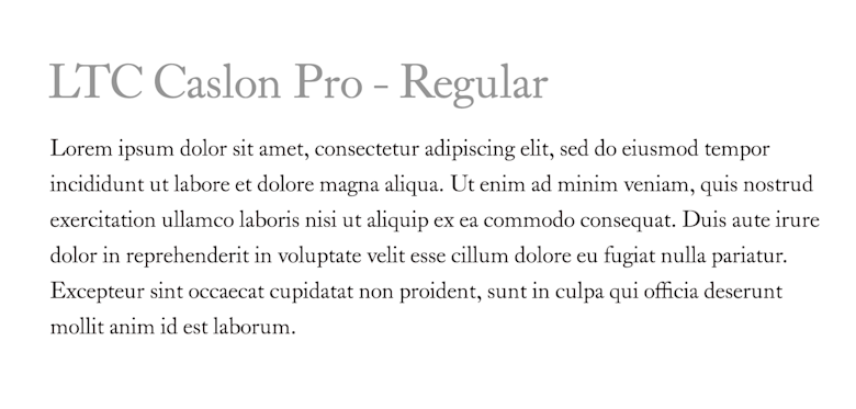
LTC Caslon Pro - Regular for long-form text
Again, our two archetypes can be seen in these typefaces. Our Caslon typefaces are like our adventurer, delivering Holy Ground some much needed passion and expression. In contrast our Inter body typeface is akin to our philosopher, providing much needed foundation and functionality.
Step 3: Creating Holy Ground’s website
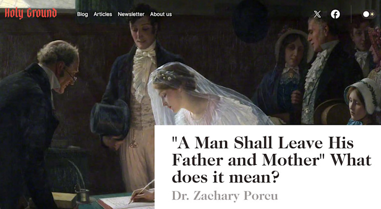
With the site’s soul-theme enabling its logo, color scheme, and typeface selection, all that was left was to structure the website. Again, we wanted a website that communicated to the user that it cared about them. Thus two major design values were finalized: a single-column layout and an emphasis on pictures and artwork. This was a beautiful decision to make since single-column content always necessarily surrenders itself to the article being read. It is not trying to distract the user with advertisements or additional articles. It is trying to get out of the way. Further, a single-column enables all sorts of wonderful typographic elements to follow such as full-width photos and enlarged pull quotes that break into the body’s margin. These are some of the best of typographic elements in the world, and are all possible via a single-column layout.

Beautiful single-column article on the Book of Enoch written by Dr. Zac Porcu
Finally, we wanted a website that was rich with pictures and images. Theology has, historically, often been a fairly dry and technical subject to teach. But this because it has historically taken the wrong approach towards education, emphasizing head knowledge over a wisdom of the heart. To make theology interesting, to keep it wild and evocative, we created a site and article structure that put images front-and-center. Thus, when a visitor opens a relatively dry titled article such as they are greeted by a full-screen image of some of the most beautiful artwork ever created, and this media makes this dry topic suddenly spring alive with vitality and potential.
Of course, aside from a media-rich single column layout, there were hundreds of additional decisions to make around sizing, whitespace, organization, tags and categories, etc. In the end, we finalized the design that you see before you right now.
Conclusion: Thank you to all who helped
Holy Ground launches today. Looking back upon the journey of its creation is such a treat. It is so rewarding to think back to those early discussions about Holy Ground’s identity, about its soul-themes, and to see how they manifested in the site’s particular logo and typeface. We could not be prouder towards how everything turned out. Naturally, there is no guarantee that this site will survive the coming years. But with a structure and design like this, it is surely set up to succeed as best as it can.
Thank you to all the talented people (family, friends, developers, and especially the designers) who helped bring Holy Ground's design to this day.
Subscribe
Life-giving writing by Christian scholars sent to your inbox once per month
Dr. Simon Cunningham is the founder and director of Holy Ground. He has a PhD in theology from the University of Nottingham in the UK. Simon is passionate about faithful Christian existential theology, namely theology that interacts with the tangible, immediate, and real elements of life.
Keep reading
Holy Ground is Changing the Quality of Online Theology
